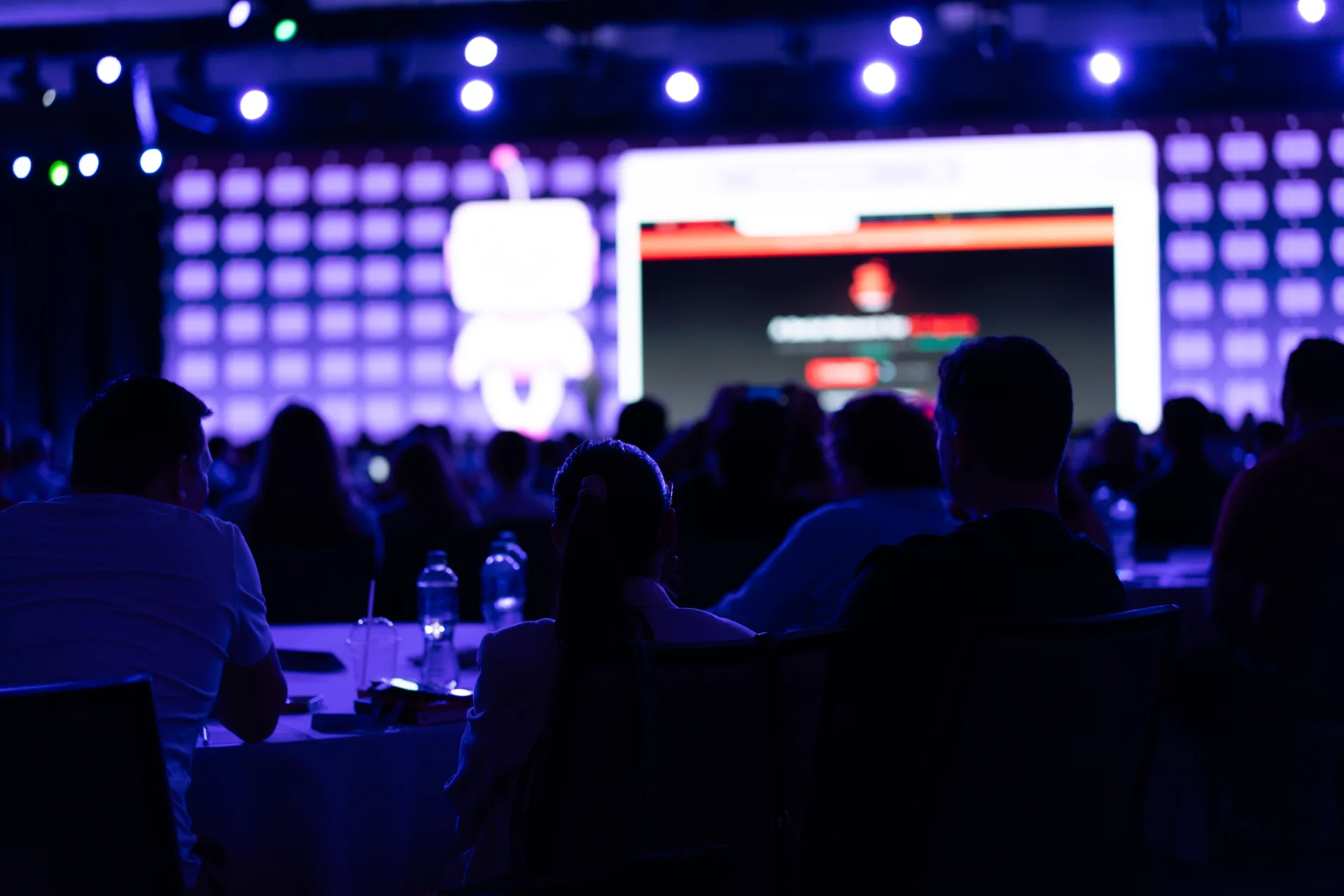
General session design is the sum of decisions most attendees never see until one of them fails: sight lines from row Q, a hero wall that reads at 60 feet, lighting looks that shift without a visible reset, and an opening twelve minutes that earns attention instead of losing it to phones. This guide covers what to spec before the RFP, what to lock in rehearsal, and the production checklist that keeps a ballroom session feeling intentional from walk-in through Q&A.
You already know IMAG exists. The question is whether your room depth, seating layout, and show format actually require it — and whether scenic, LED, and lighting are working as one system or fighting each other on show day.
Design the room from the back row first
Every general session plot should start at the farthest seat, not the stage lip. Planners who walk the room once from the back half catch problems that render beautifully from the front.
Back-row attendees judge the session on three things: can they read slide content, can they see faces and gestures, and does the stage feel present or distant. A hero LED wall that looks crisp from row C often turns into a glowing smear from the balcony — not because the wall is wrong, but because pixel pitch, content scale, and viewing angle were never tested from the seats that matter.
Use this sight-line checklist before you sign off on scenic or wall sizing:
- Walk every seating section — center, side aisles, and any obstructed zones; photograph what the stage actually looks like from the worst seat, not the VIP table.
- Decide IMAG vs hero wall early — if room depth exceeds roughly 60 feet with flat floor seating, or your format includes panels and movement, you likely need image magnification, not just a bigger wall. See our guide on IMAG and delay screens for the trigger list.
- Confirm delay coverage — deep convention halls often need repeat displays fed the same program content; a single monolithic wall cannot solve every sight-line problem.
- Mark presenter positions — lectern, panel chairs, and walk paths; scenic portals and oversized wings block views that look fine on a floor plan.
- Test slide legibility — 10-point body copy on a 40-foot wall is unreadable from the back; design templates for the farthest row, then scale up.
If marketing wants a dramatic scenic reveal but the room is 400 feet deep, the design conversation is about where faces and content live on screen — not about adding another logo wing.
Named looks — walk-in, session, video, Q&A
General sessions fail visually when every segment looks like a dimmer guess. Production teams work faster — and presenters look more polished — when lighting, wall content, and house levels are named presets, not improvised between cues.
Lock these looks in your production brief and rehearsal schedule:
- Walk-in — house at 40–60%, stage wash with brand color, no blinding backlight on the first rows; music and signage active, hero wall on loop or holding slide.
- Session / presenter — key light on marks, house down to your agreed minimum (often 20–30% for note-taking audiences), wall on slides or IMAG as planned.
- Video roll — house to full blackout or near-black, wall on playback, no stray followspot on the empty stage; confirm audio routing before the first frame.
- Panel / fireside — per-position keys or a shared wash that keeps all faces readable on IMAG; moderator and active speaker both visible without a manual scramble.
- Q&A — house up slightly if the audience needs to see neighbors, roaming mic zones lit, IMAG on the active questioner if your format includes audience shots.
- Exit / transition — preset that clears the stage for changeover or awards without a visible "reset" moment the audience watches.
Each look should have an owner: lighting console, media server, and house dimmer. Vague language like "make it feel professional" guarantees a different interpretation at every cue. If your show uses keynote stage lighting presets, name them in the run-of-show — LD, show caller, and video shader should call the same labels.
Pacing the first twelve minutes so phones stay down
Attention is not a lighting cue — but the first twelve minutes behave like one. Attendees decide whether the session is worth full focus before most presenters reach their second slide. Production design supports that window or undermines it.
Structure the open deliberately:
- 1.Minutes 0–3: Walk-in to settle — avoid starting cold while half the room is still finding seats; use a timed hold slide or short loop, not dead air on a black wall.
- 2.Minutes 3–7: Host or emcee frames the session — one clear outcome stated out loud; house and stage look should match "we are starting," not "we are still in walk-in."
- 3.Minutes 7–12: First substantive beat — first speaker on marks, first IMAG shot if applicable, first slide with readable type; audio check completed before doors, not after the CEO walks on.
Production decisions that protect this window:
- Rehearse the open, not just the keynote — emcee mic, first slide trigger, first lighting look, and first camera shot should be cued; the opening fumble is the most visible failure in the room.
- Keep house-light policy consistent — if row twenty needs to read a handout, dropping house to 5% for "drama" in minute four sends a mixed signal.
- Limit pre-show video length — a ninety-second sizzle before the host speaks is fine; a six-minute brand film before anyone says hello is a phone magnet.
- Confidence systems ready — presenter timers, return feeds, and notes visible before talent hits the mark; fumbling with playback in the first segment reads as unprepared, regardless of deck quality.
Pacing is a design choice shared by show caller, LD, and content lead — not something the first speaker improvises after a late sound check.
What to lock with scenic vs LED vs lighting
Scenic, LED, and lighting each solve different problems. When they are specified in silos, you get a beautiful set that washes out on camera, a wall that fights your brand scrim, or a lighting plot that ignores where the hero content actually lives.
Lock these handoffs before design finalizes:
Scenic
- Trim height and sight lines — portals, steps, and masking that block balcony views; confirm speaker height relative to the first row.
- Integration points for LED — ground-supported vs flown wall placement, cable paths, and weight loads on the deck; scenic cannot "add a wing" after the wall structure is engineered.
- Color and texture under stage light — matte finishes and agreed paint samples under 5600K keys; glossy scenic reads as hot spots on IMAG.
LED / projection
- Content safe zones — lower-thirds, logos, and live IMAG framing; see LED wall sizing for pixel pitch by seating distance, not for repeating that entire article here.
- Processor inputs — slides, IMAG, playback, and backup paths named in the tech rider; one "wall input" is not a spec.
- Failover — holding slide, backup playback, and who switches on a freeze; general sessions do not get a second take.
Lighting
- Layer names tied to looks — key, fill, backlight, and specials documented per segment; see our event lighting services scope for what a corporate LD typically delivers.
- Camera and IMAG agreement — LD and video shader sign off on skin tone and exposure during focus, not five minutes before doors.
- House dimmer ownership — who fades for video, who holds for Q&A; ballroom staff and production should not both think they own the master.
Bring scenic, video, and lighting leads into one design review with a floor plan and sight-line photos. The expensive arguments happen when LED content is designed without knowing what the backlight does to a scrim.
From the floor: the preset nobody rehearsed
One general session opened with a polished walk-in look — brand wash, loop on the wall, house at fifty percent. The emcee hit the mark, the house dropped, the first slide fired, and the wall went full white on a title card while the LD was still in the walk-in preset. For eleven seconds the first twelve rows got an accidental retina test. The CEO handled it fine. The audience remembered the flash more than the welcome slide.
The fix was not a brighter wall — it was naming the "session" look in the run-of-show, programming a wall preset that matched the first slide background, and holding three minutes in rehearsal for the exact open sequence: emcee line, house fade, slide trigger, first IMAG shot. Every cue had a label. Two of them had never been run in order.
General sessions stay engaging when the back row can see, the looks are named before load-in, the opening is paced like a cue stack, and scenic, LED, and lighting are one brief — not three vendors discovering each other on the morning of. Spec the room from the worst seat, rehearse the first twelve minutes like they matter, and give your show caller presets they can call without translation.
For general session staging, wall design, and show-day operation, see our stage production services. Ready to walk through your room layout and run-of-show? Request a consultation.